By Daisy Alioto Mar 1, 2019, 7:00am EST
Welcome to Noticed , The Goods’ design trend column. You know that thing you’ve been seeing all over the place? Allow us to explain it. What it is: A digital or print effect where one color fades into another. Typically rendered in soft or pastel tones. Where it is: Gradients are seemingly everywhere in media and marketing. They are part of a suite of Facebook status backdrops introduced in 2017 and the branding for the New York Times’ popular podcast The Daily, which displays a yellow to blue gradient. Gradients have taken over Coachella ’s app and website (if you watch carefully, the colors shift). Ally’s billboard in A Star Is Born is a full-on gradient, and so was the branding for the Oscars ceremony that recognized Lady Gaga. On Instagram, they provide a product backdrop for popular Korean beauty brand Glow, and have been embraced by indie magazines Gossamer and Anxy — both designed by Berkeley studio Anagraph . On the luxury front, Brooklyn wallpaper company Calico has released an entire collection of gradient wallpapers called Aurora. Meanwhile, Spanish fashion house Loewe has introduced a version of their trendy Elephant bag in a spectrum of pink to yellow.
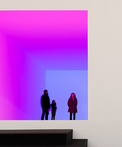
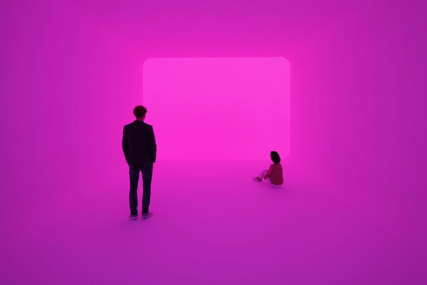
Are gradients drinkable? Heck yes, they are. Seltzer startup Recess has gone all-in on gradients in their branding. Why you’re seeing it everywhere: Gradients are the confluence of three different trends: Light and Space art, vaporwave, and bisexual lighting. In the art and design world, Light and Space — developed in the 1960s and ’70s — has been experiencing a revival thanks to its Instagramability. Light and Space pioneer James Turrell has been embraced by celebrities like Beyoncé, Drake, and Kanye West. Drake’s Hotline Bling video was inspired by Turrell’s light-infused rooms called Ganzfelds. The Kardashian-Jenner-West crew posted an Instagram in front of one of Turrell’s works in Los Angeles. (I was yelled at by security for taking a picture there but it’s fine.)
Most recently, West donated $10 million dollars to the artist. James Turrell’s works come with a warning because the visitor quickly loses all depth perception. Soft gradients are alluring because they cut through the noise of social media, but they also are disorienting. The Twitter bot soft landscapes operates on a similar principle, but some days the landscape all but disappears. “It’s nice to see calming things amongst all of the social ramifications of Instagram,” says Rion Harmon of Day Job, the design firm of record for Recess. Harmon compares the Recess branding to a sunset so beautiful you can’t help but stare (or take a picture) however busy you are. Changes to the sky are even more pronounced in Los Angeles, where Harmon’s studio is now based. “The quality of light in LA is something miraculous,” he says. The Light and Space movement was also started in Southern California, and it’s in the DNA of Coachella. Gradients might be a manifestation of longing for sunshine and surf. But they also belong to the placeless digital citizen. 1980s and ’90s kids may remember messing around in Microsoft Paint and Powerpoint as a child, filling in shapes with these same gradients. It’s no surprise that this design effect is part of the technological nostalgia that fuels the vaporwave movement. Vaporwave is a musical and aesthetic movement (started in the early 2010s) that spliced ambient music, advertising, and imagery from when the internet started. Gradient artwork shared by the clothing brand Public Space is vaporwave. So is this meme posted by direct-to-consumer health startup Hers.
When Facebook rolled out gradient status backgrounds in 2017, they knew what they were doing.
“They have so much data into how the world works,” says Kerry Flynn, platforms reporter at Digiday. “They had a slow rollout to the color gradients … Obviously they could have pulled the plug anytime.”
Flynn goes on to explain that Facebook realized they had become their own worst enemy. There was so much information on their platform that personal sharing was down and they had to make it novel again. “Facebook wants our personal data, as much as possible. Hence, colorful backgrounds that encourage me to post information about myself and for my friends to ‘Like’ it and comment,” she says. It’s ironic that in order to do so, Facebook borrowed from a digital texture most millennials associate with a time before Facebook. But it also mimics a current trend in film and television: bisexual lighting. As Know Your Meme explains, “bisexual lighting is a slang in the queer community for neon lighting with high emphasis on pinks, purples, and blues in film.” These pinks, purples and blues often fade into one another — appearing like a gradient when rendered in two dimensions. Bisexual lighting shows up in the futuristic genre cyberpunk, which imagines an era in which high technology and low technology combine and cities are neon-bathed, landmarkless Gothams. (Overlapping with vaporwave.) Mainstream examples of cyberpunk include Blade Runner, Ghost in the Shell, and Black Mirror (specifically the “San Junipero” episode). Hotline Bling makes the list of examples for bisexual lighting; the gradients come full circle. Tati Pastukhova, co-founder of interactive art space ARTECHOUSE , says gradients have become more popular as computer display quality increases. She says the appeal of gradients is “the illusion of dimension, and giving 2-D designs 3-D appeal.” ARTECHOUSE is full of light-based digital installations, but visitors naturally gravitate toward what is most photogenic — including, unexpectedly, the soft lighting the space installed along their staircase for safety reasons.
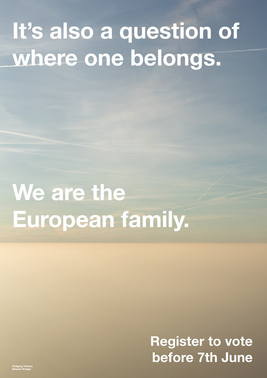
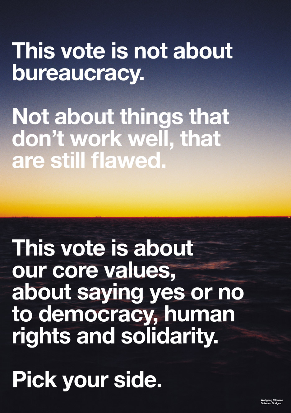
Before gradients, neon lettering was the Instagram lighting aesthetic du jour. Gradients are wordless — like saying Live Laugh Love with just colors. “There’s an inherent progression in gradients, you are being taken through something. Like that progression of Live Laugh Love. Of starting at one point and ending at another point. Evoking that visually is something people are very drawn to,” says Taylor Lorenz, a staff writer at the Atlantic who covers internet culture. Gradients are also boundaryless. In 2016, artist Wolfgang Tillmans used gradients in his anti-Brexit poster campaign. Through gradients, designers have found the perfect metaphor for subjectivity in an era when even the word “fact” is up for debate.
“Gradients are a visual manifestation of all of these different spectrums that we live on,” including those of politics, gender, and sexuality, says Lorenz. “Before, I think we lived in a binary world. [Gradients are] a very modern representation of the world.”
At the very least, gradients offer an opportunity to self-soothe. Calico co-founder Nick Cope says the Aurora collection is often used in meditation rooms. He and his wife have installed it across from their bed at home. “The design was created to immerse viewers in waves and washes of tranquil atmospheric color,” Cope says, adding,
“Regardless of the weather, we wake up to a sunrise every morning.”
:format(webp)/cdn.vox-cdn.com/uploads/chorus_image/image/63138164/Gradients_05.1551300684.png)
:format(webp):no_upscale()/cdn.vox-cdn.com/uploads/chorus_asset/file/14635853/Aurora_Vignette_IMG_6375_03.jpg)
:format(webp):no_upscale()/cdn.vox-cdn.com/uploads/chorus_asset/file/14636049/6pack_gradient.png)