&
&


Playfair Display
FONT PAIRING
Raleway

Raleway is an elegant sans-serif typeface family intended for headings and other large size usage. Initially designed by Matt McInerney as a single thin weight, it was expanded into a 9 weight family by Pablo Impallari and Rodrigo Fuenzalida in 2012 and iKerned by Igino Marini.
Georgia
Even at small sizes the face exudes a sense of friendliness. This is as much testament to the skill of the typeface’s designer, Matthew Carter, as it is to any intrinsic quality of the face’s design, since the small pixel spaces of the screen can be a harrowing canvas for any type designer.
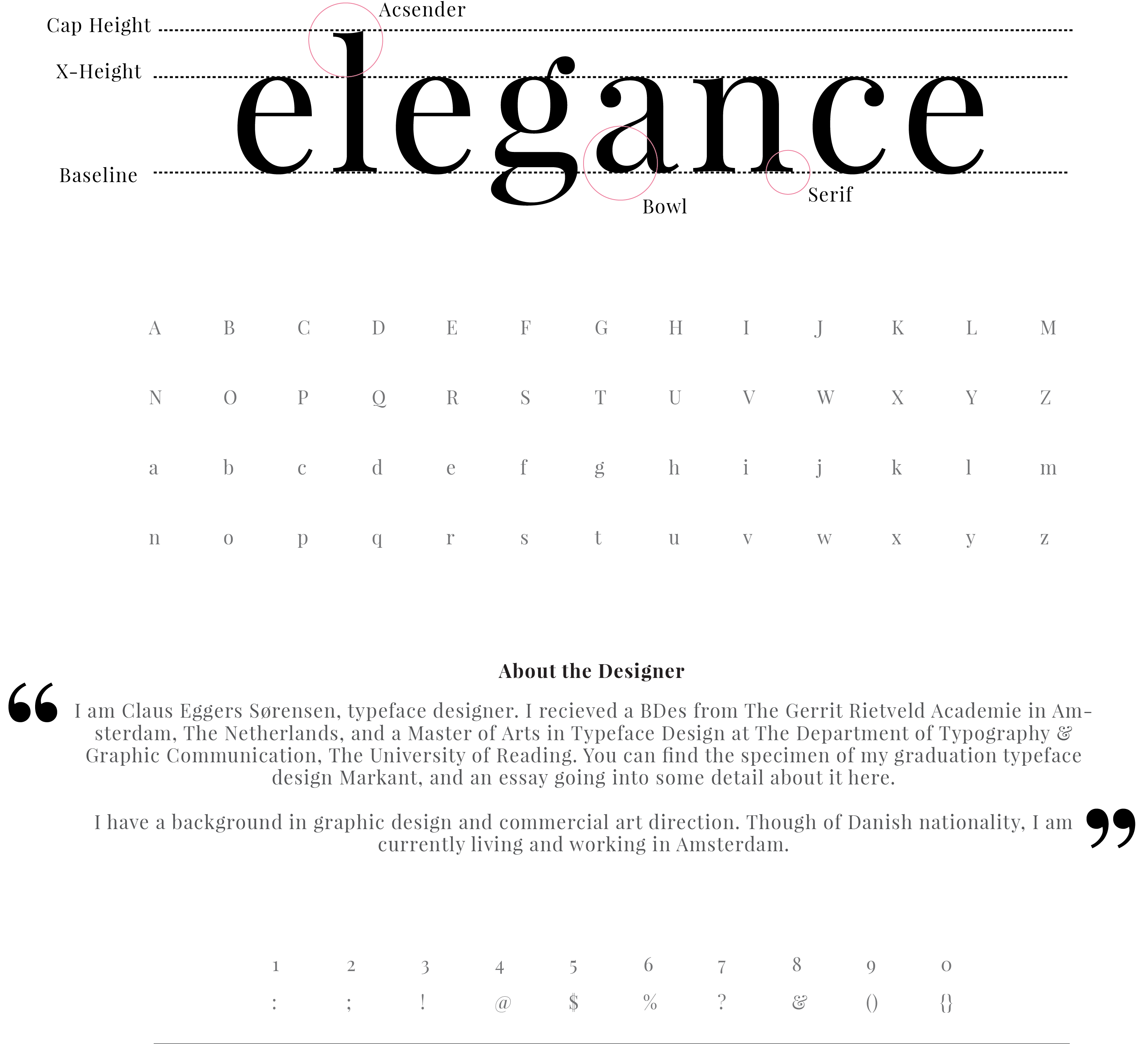
Playfair is a transitional design. From the time of enlightenment in the late 18th century, the broad nib quills were replaced by pointed steel pens. This influenced typographical letterforms to become increasingly detached from the written ones. Developments in printing technology, ink, and paper making, made it possible to print letterforms of high contrast and delicate hairlines.
This design lends itself to this period, and while it is not a revival of any particular design, it takes influence from the designs of printer and typeface designer John Baskerville, the punchcutter William Martin's typeface for the 'Boydell Shakspeare' (sic) edition, and from the 'Scotch Roman' designs that followed thereafter.
